Creative Solutions
Out-of-home (OOH) provides one of the largest and most impactful creative canvases in advertising. Let our award-winning creative teams help you bring your ideas to life with a myriad of creative capabilities.
We’ll consult with you and share best practices
At Clear Channel Outdoor (CCO) we have a centrally led NY-based creative hub and six creative teams, located in our regions across the U.S. We work with customers to develop breakthrough, brand-building campaigns, provide consultative services, develop mock-up examples of campaign executions, design full-scale OOH campaigns, and advise on out-of-home best practices.
OOH creative best practices
Our creative team stands by eight core best practices that can make your OOH advertising visually stunning and deliver a strong message:
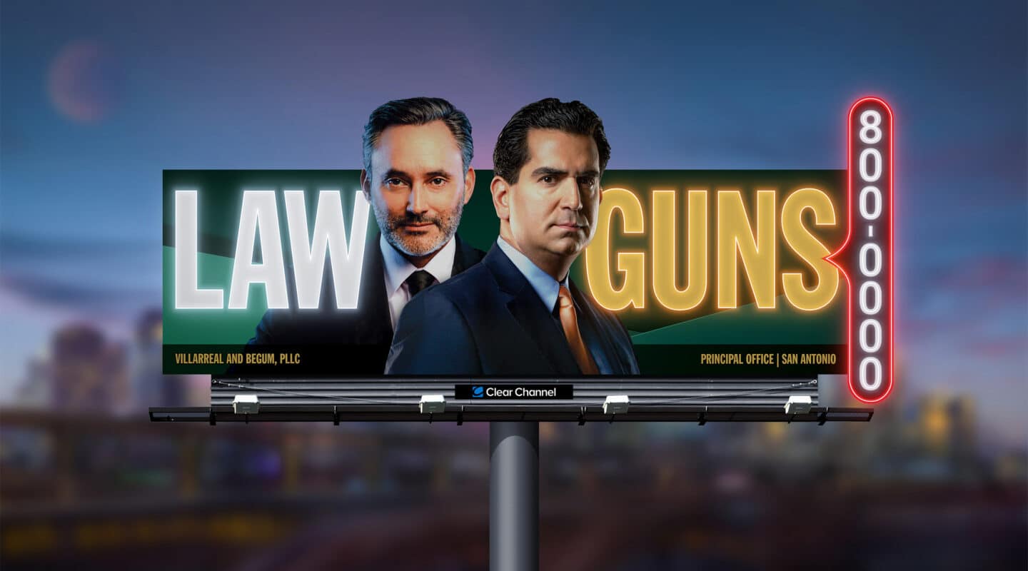
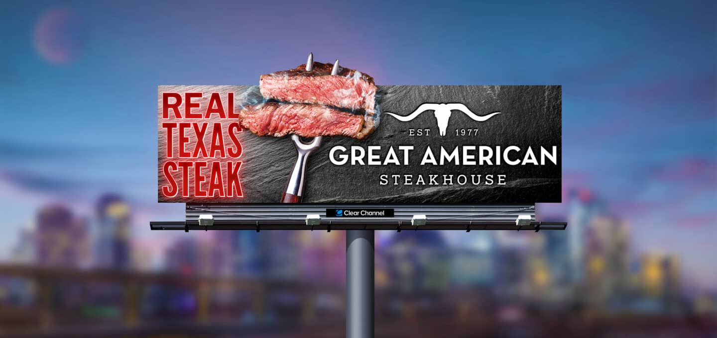
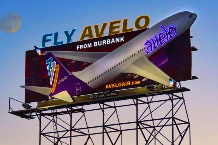
Think outside of the box with our OOH print capabilities
With an extensive number of printed billboard options, we can help you make an impact with your OOH campaigns.
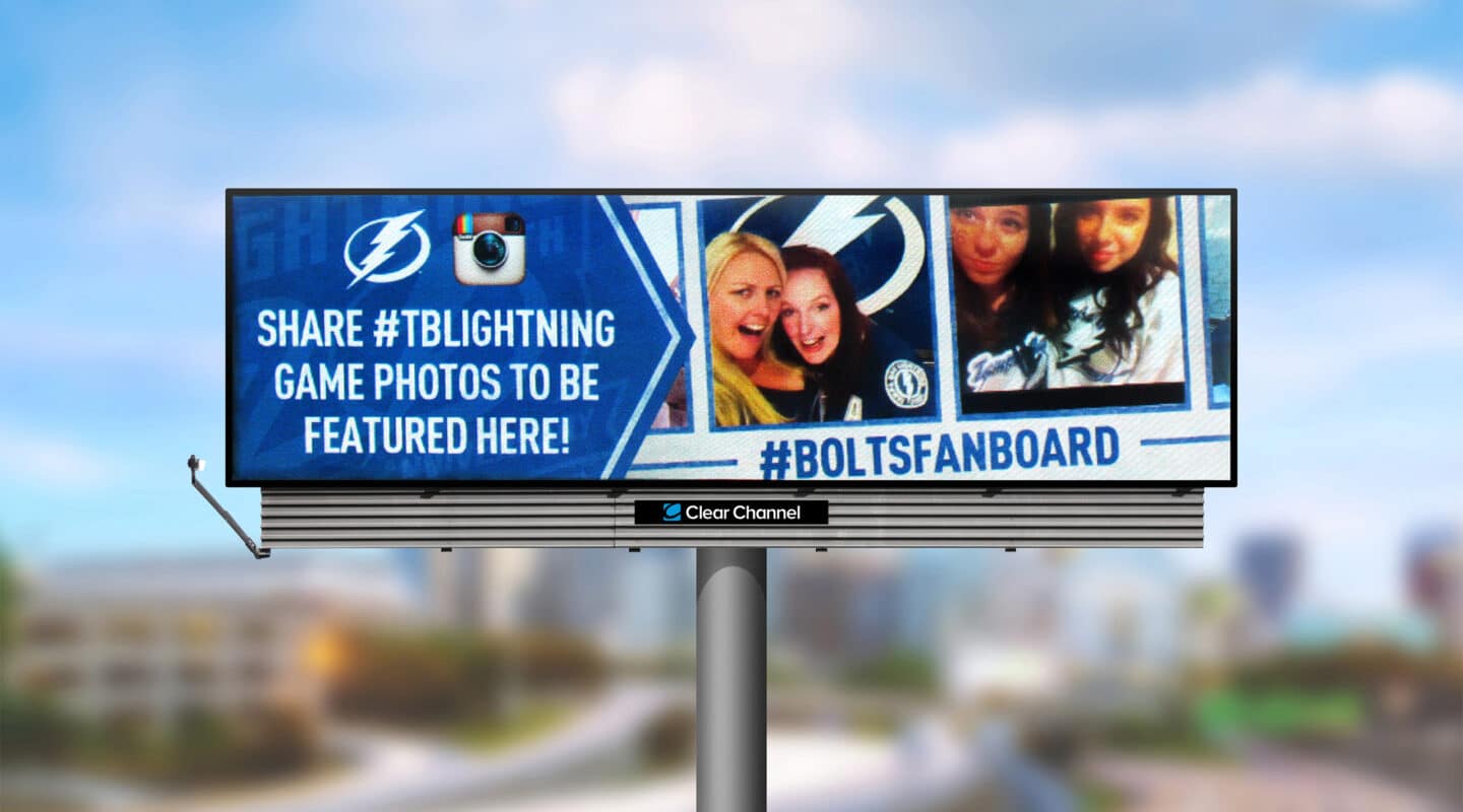
Deploy our dynamic digital capabilities for campaign flexibility
Our digital display capabilities allow us to make campaign changes quickly and be the agile partner that many customers desire.
Our image archive
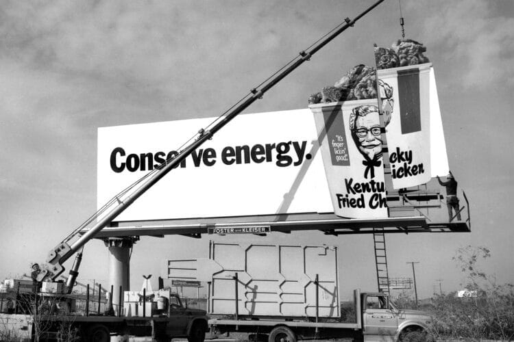
We maintain one of the largest archives of out-of-home imagery in the U.S. Containing more than 1.3 million curated, high-quality images of OOH campaigns dating back to the early 20th century, our expansive image library offers a glimpse into the history of outdoor advertising. This in-depth archive is managed by our two skilled library scientists. If you’re interested in seeing how OOH has helped build brands over time or if you need some inspiration, we can look into curating a gallery for you.
Contact Us
Interested in learning more about our creative solutions?
Complete the form to let us know how we can help you.
Clear Channel Outdoor RADAR®, RADARView®, RADARProof®, RADARConnect®, and RADARSync®, are registered trademarks of Clear Channel IP, LLC.